Skip to content
WORK

Every project started with one annoyance.

Some of this was commissioned, the rest we built for ourselves. For each one: what was wrong, what we built and what changed.

01Website and articles · for a facade company

Tarmor Ehitus

What was wrong
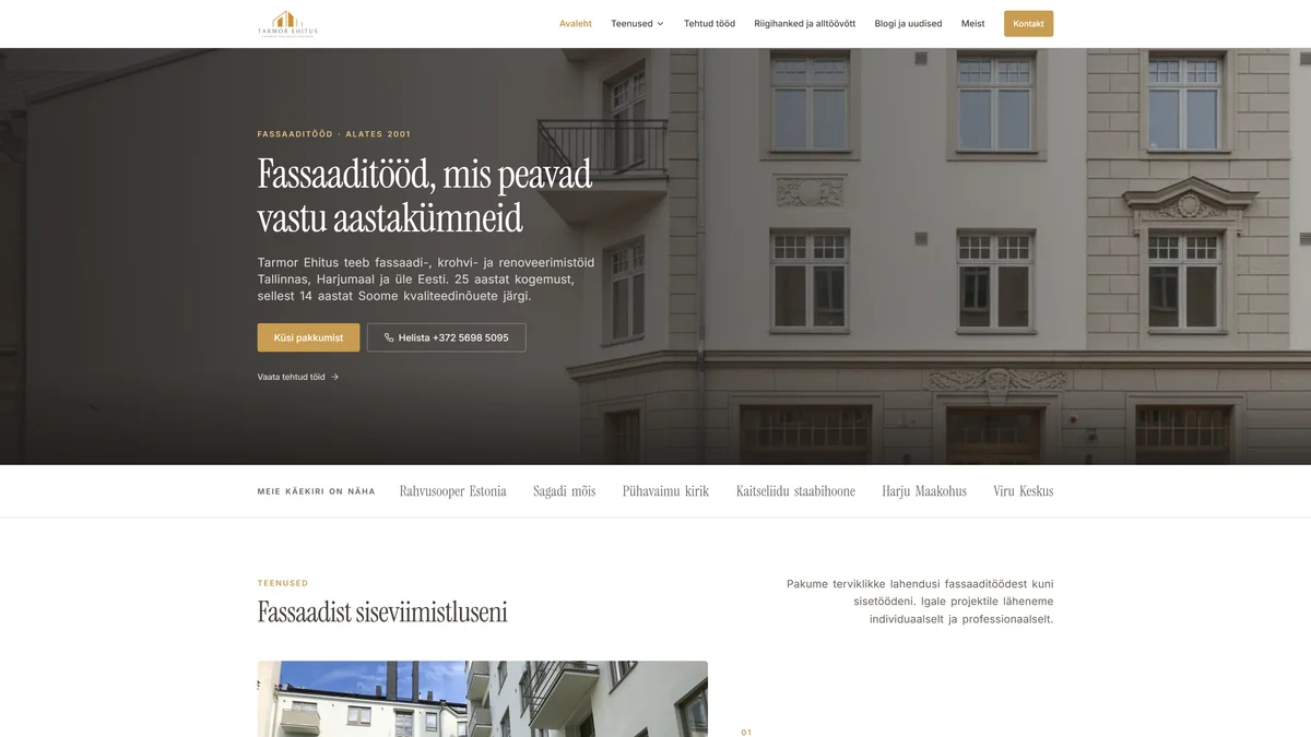
The old site was built for a desktop screen, and on a phone there was nothing you could do with it. Half the finished jobs were nowhere to be seen.
What we built
A new structure built around real jobs, photos per project, and an enquiry form that lands straight on Tarmor's phone. And articles that explain the work before anyone asks for a quote.
What changed
A quote request now starts with a client who has already seen the work and read the articles. More enquiries arrive than can be taken on.
Visit the site
tarmorehitus.ee
The Tarmor Ehitus website, a renovated facade as its hero image with a row of past projects below.
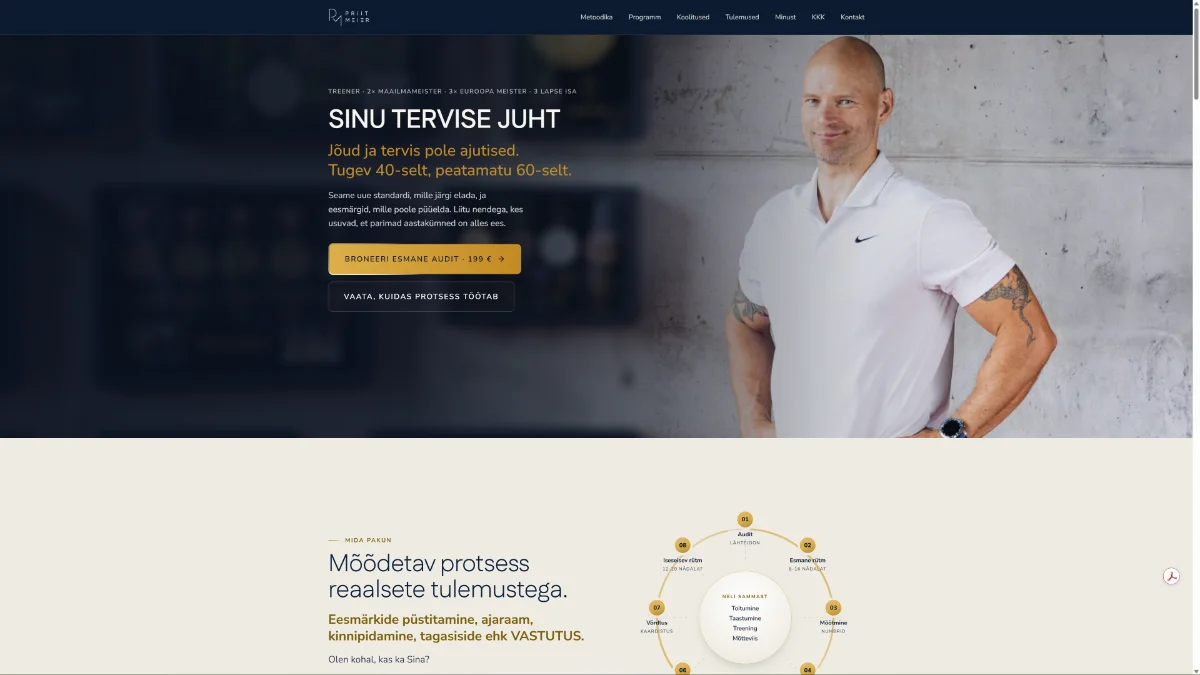
priitmeier.com
Priit Meier sales page with the booking button.
02Sales page and booking · for a coach

Priit Meier

What was wrong
The name was known in his circle, but online a world champion had no link to hand anyone.
What we built
One clear page: what he does, who it is for, which region he covers, and a form that asks only what is needed. We have kept building on it with him ever since.
What changed
First contact now comes through the form, not as a call at half past seven in the evening.
Visit the site
03Bilingual website · for an accounting firm

Baltic Business Advice

What was wrong
A firm that sells trust looked like a thousand other firms.
What we built
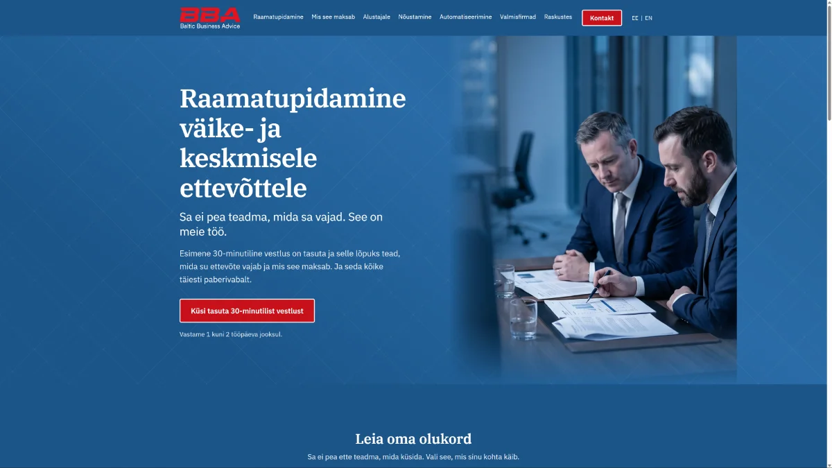
A clear service list, the pricing logic explained, the people made visible, content in two languages.
What changed
A client can tell before the first call whether this firm fits them.
Visit the site
bbadvice.eu
The bilingual Baltic Business Advice website with services on the front page.
Our own projects

When the market leaves a gap,
we do not wait for a brief.

None of these three came from a brief. The gap was there and we built them ourselves, on our own time and money.

Our own product · website and working system

Plaanimuutus

What was wrong
Building documentation is a field where the owner does not know what to ask for. The terms are survey drawings, the building register and the occupancy permit, but what is actually on the owner's mind is that the bank will not give a loan. Between the two there was no place where the conversation starts from the situation the owner is in.
What we built
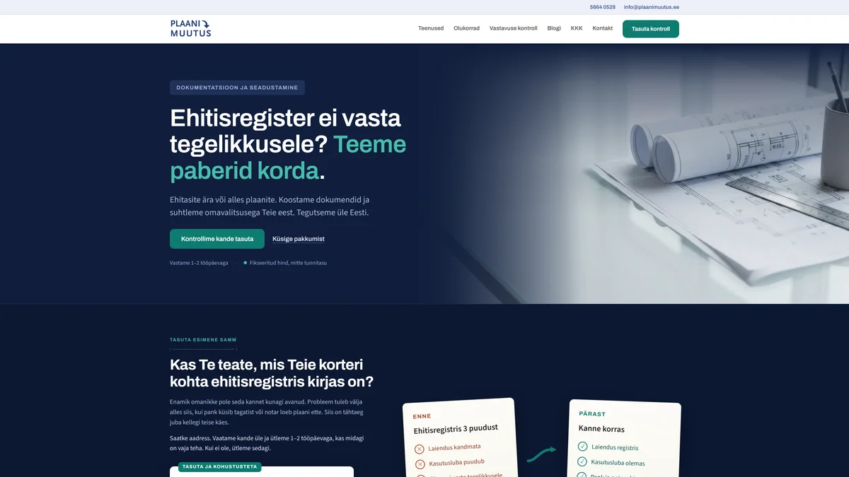
We built the whole thing: the service, the website and the system that actually runs the work. The page opens with the question of whether the building register entry matches reality, and offers a free register check as the first step rather than a quote.
What changed
A person recognises their own situation on the page and calls once they know what to ask.
The visible part is the website. The work runs in a system we built ourselves.
Visit plaanimuutus.ee
plaanimuutus.ee
The Plaanimuutus website, its headline asking whether the building register matches reality.
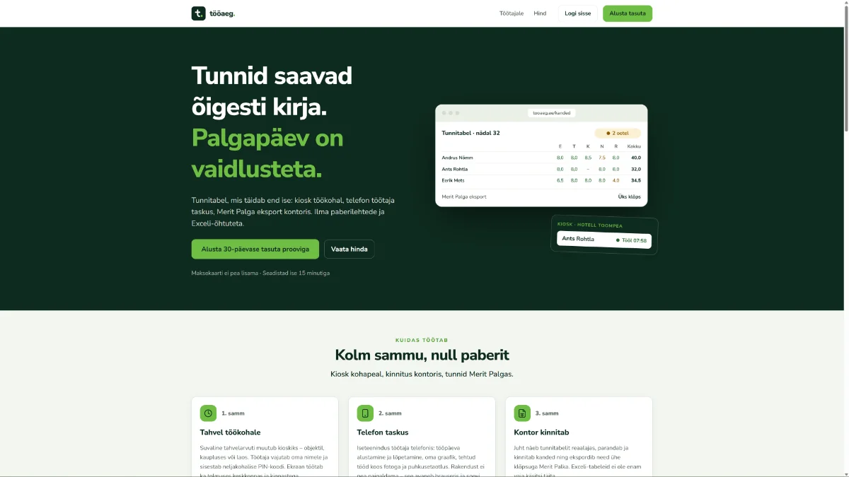
tooaeg.ee
The Tööaeg website, its sample timesheet showing two entries waiting for approval.
Our own product · kiosk, phone and office

Tööaeg

What was wrong
There is plenty of time tracking on the market, but it is built for a person with a desk and a laptop. Hourly work happens where there is no desk: on site, in a corridor, in a workshop. When there is no place to log the hours where the work happens, the timesheet gets filled in on Friday from memory.
What we built
We built the same record in three places at once: a kiosk on the wall at the workplace, a phone in the worker's pocket, and an office view where the manager approves the timesheet and sends it to payroll software. We did not build a rollout project: the client opens the account themselves and setup takes a quarter of an hour.
What changed
The hour is recorded where it was worked, not on Friday from memory. Payday becomes arithmetic, not a dispute.
The product sells itself: trying it needs no call, no card and no rollout project.
Visit tooaeg.ee
Our own project · affiliate content site

MEXCBonusCode

What was wrong
Someone wants the service on better terms and goes looking for a code to enter when signing up. The pages already there repeated the same promotional line and never said what the code gives, what it costs, or that warnings have been published about the exchange.
What we built
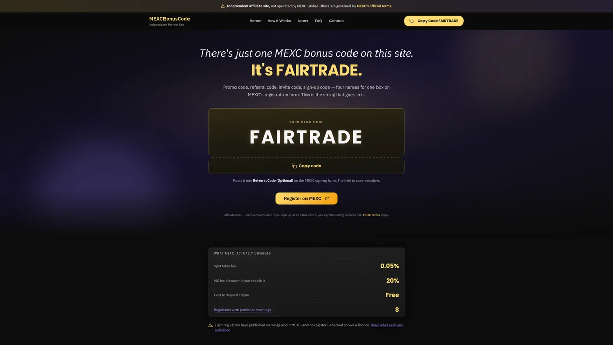
An English content site carrying our partner code. The exchange pays us a commission on anyone who signs up with it, and the site says so on the page. We wrote out the fees, the terms and the limits, including the warnings eight regulators have published about the same exchange the income comes from.
What changed
The niche now has a page that states the fees and the warnings. For us it is a structure that repeats on any product with a partner programme.
The gap was there and the site was live before anyone had time to ask for a brief.
Visit mexcbonuscode.com
mexcbonuscode.com
The MEXCBonusCode website, one code in a large box with MEXC's fees listed figure by figure below.

The next project starts with two sentences from you.

Tell us what it has to do. We reply within 24 hours.
Start a project